3. Usage
This Chapter deals with some features of pyGCluster and explains the basic usage.
The following examples are executed within the Python console (indicated by “>>>” ) but can equally be incorporated in standalone scripts.
pyGCluster is imported and initialized like this:
>>> import pyGCluster
>>> cluster = pyGCluster.Cluster( )
3.1. Clustering
3.1.1. preparing input data
The pyGCuster input has to be nested python dictionary with the following structure
>>> data = {
...            Identifier1 : {
...                            condition1 :  ( mean11, sd11 ),
...                            condition2 :  ( mean12, sd12 ),
...                            condition3 :  ( mean13, sd13 ),
...             },
...            Identifier2 : {
...                            condition1 :  ( mean21, sd21 ),
...                            condition2 :  ( mean22, sd22 ),
...                            condition3 :  ( mean23, sd23 ),
...             },
... }
>>> import pyGCluster
>>> cluster = pyGCluster.Cluster( data = data )
Note
If any condition for an identifier in the “nested_data_dict”-dict is missing, this entry is discarded, i.e. not imported into the Cluster Class. This is because pyGCluster does not implement any missing value estimation. One possible solution is to replace missing values by a mean value and a standard deviation that is representative for the complete data range in the given condition.
3.1.2. clustering using do_it_all
A simple way to cluster away and to print the basic plots is to evoke pyGCluster.Cluster.do_it_all(). This function sets all important parameters for clustering and plotting. E.g.
>>> cluster.do_it_all(
...     distances = [ 'euclidean', 'correlation', 'minkowski' ],
...     linkages = [ 'complete', 'average', 'ward' ],
...     cpus_2_use = 4,
...     iter_max = 250000,
...     top_X_clusters = 0,
...     threshold_4_the_lowest_max_freq = 0.01,
...     min_value_4_expression_map = None,
...     max_value_4_expression_map = None,
...     color_gradient = '1337_2',
...     box_style = 'classic'
... )
For all available distance metrics and linkage methods, see the documentation of SciPy, sections scipy.spatial.distance and scipy.cluster.hierarchy.linkage.
3.1.3. clustering using resample
Alternatively, one can cluster only by using the pyGCluster.Cluster.resample() function. As for pyGCluster.Cluster.do_it_all(), one can specify a series of parameters. The minimal set is:
>>> distances = [ 'correlation', 'euclidean', 'minkowski' ]
>>> linkages   = [ 'complete', 'average', 'ward' ]
>>> cluster.resample(   distances       = distances,
...                     linkages        = linkages,
...                     pickle_filename = 'pyGCluster_resampled.pkl')
Warning
If no pickle_filename is specified, no pickle will be written!
3.1.4. saving the clustered data
Generally, the results are pickled into the working directory by calling pyGCluster.Cluster.save()
3.1.5. loading the clustered data
Clustering requires some time and is executed on servers or workstations. After successful clustering a pickle object is stored that can be analyzed on a regular Desktop machine. The pyGCluster Python pickle object, can be loaded and processed as follows:
>>> cluster.load( 'path_to_pyGCluster_pkl_file.pkl' )
Before starting, it may be necessary to define an output directory or ‘Working directory’ in the pyGCluster.Cluster object, where all the figures will be plotted into.
This can be done by simply editing the keys in the pyGCluster.Cluster object:
>>> cluster['Working directory'] = '/myPath/'
3.2. Clustered data visualization
Prior clustering several parameters have to defined in order to control, e.g. memory usage. This is done by the kwargs ‘minSize_resampling’ and ‘minFrequ_resampling’. Normally, it is not obvious how many clusters and communities are finally obtained. Therefore the user can specify how many of the top X clusters should be taken into consideration for plotting. Obviously, one can not specify a minimum cluster size smaller than the original cluster input parameter.
3.2.1. Communities assignment
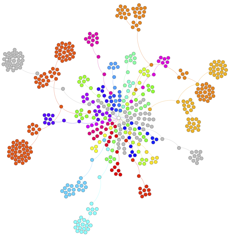
The communities can be plotted using different options. Prior any visualization scripts the communities have to be specified.
This can be done by the pyGCluster.Cluster.build_nodemap() function.
This command create communities from a set of the top 0.5% most frequent clusters with a minimum cluster size of 4:
>>> cluster.build_nodemap( min_cluster_size = 4, threshold_4_the_lowest_max_freq = 0.005 )
Note
These values can be modified in order to vary the community number and composition, the higher the threshold, the less clusters are included, i.e. the quality/stringency is increased.
3.2.2. Write DOT file
Create the DOT file of the node map showing the cluster composition of the communities. A filename can be defined and the number of nodes for the legend. The function pyGCluster.Cluster.write_dot() can be used:
>>> cluster.write_dot( filename = 'example_1promilleclusters_minsize4.dot',\
... n_legend_nodes = 5 )
The DOT file can be used as input for e.g. gephi and a nodemap can be build.
3.2.3. Plot community expression maps
Draw a expression map showing the protein composition of each community. We set the color range to 3 in both directions and choose a predefined color range (‘1337_2’) as shown in the example expressionmap below (link to figure) by using the pyGCluster.Cluster.draw_community_expression_maps() function:
>>> cluster.draw_community_expression_maps(
...     min_value_4_expression_map = -3,
...     max_value_4_expression_map = 3,
...     color_gradient = 'default'
... )
Note
One may want to adjust the color range depending on the range of the values which should be visualized. The log2 range of 3 fits in the example case for proteomics data. When visualizing transcriptomics data, a broader range is required.
This example expression map shows an example (Photosystem I community) from the supplied data set of Hoehner et al. (2013)
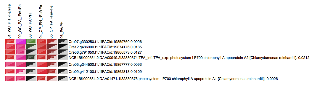
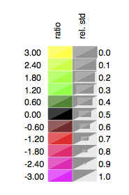
The corresponding legend is plotted as well. The color represents the regulation ranging from red (downregulated) over black (unregulated) to green/yellow (upregulated)
3.2.3.1. Color gradients
The gradients that are currently part of pyGCluster are
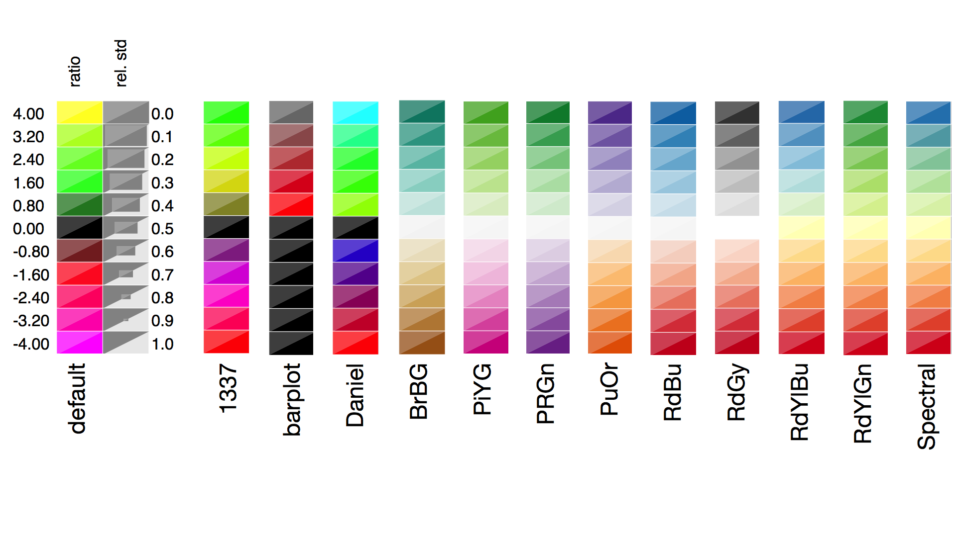
Gradients 5 - 13 are taken from Color brewer 2.0 http://colorbrewer2.org/
Color gradients are stored in cluster[ ‘expression map’][ ‘Color Gradients’ ] and can additionally be defined by the user. E.g.:
>>> cluster[ 'expression map'][ 'Color Gradients' ][ 'myProfile' ] =
... [ (-1, (255,0,0)) , (0, (0,0,0)), (+1, (0,255,0 ))]
which would create a new profile with the name myProfile. The list contains tuples and within each tuple, the first number represents the relative induction to the plotted data set or relative to the defined min and max values and the second tuple represent the color in r,g,b format (0, .. , 255).
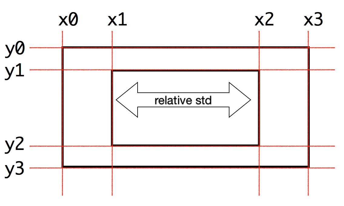
3.2.3.2. Box styles
The box styles that are currently part of pyGCluster are
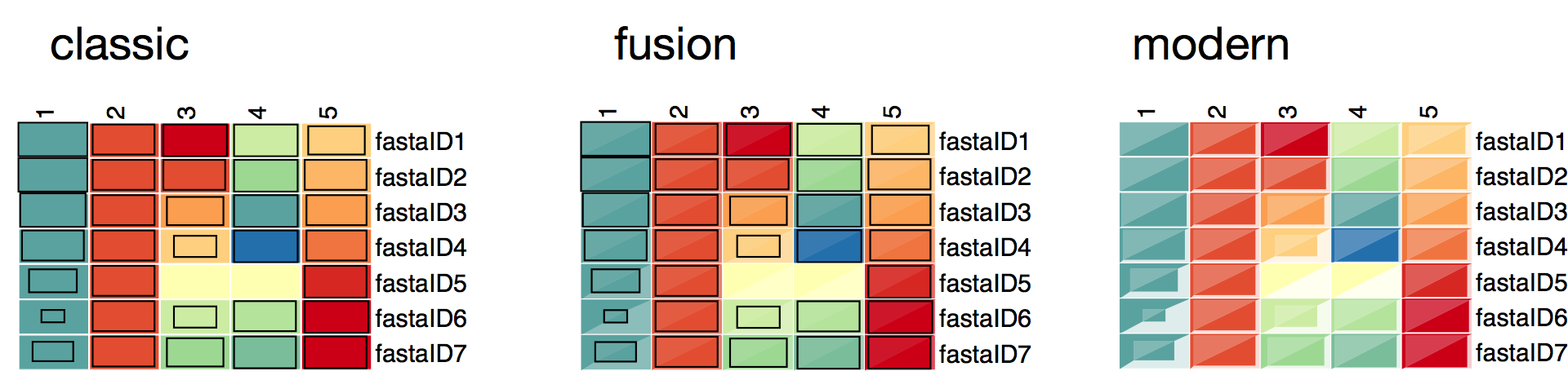
The box styles are stored in cluster[ ‘expression map’][ ‘SVG box styles’ ]. The general format is a string that contains SVG code using Python string format placeholders. E.g.
Coordinate definition is:
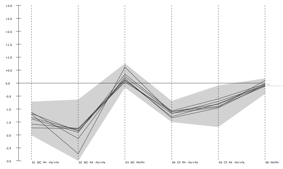
3.2.4. Plot expression profile
Expression profile can be plotted for every community, to further visualize the overall regulation of all objects in this community, by using the function pyGCluster.Cluster.draw_expression_profiles():
>>> cluster.draw_expression_profiles(
...     min_value_4_expression_map = -3,
...     max_value_4_expression_map = 3
... )
An example of an expression profile is given below.
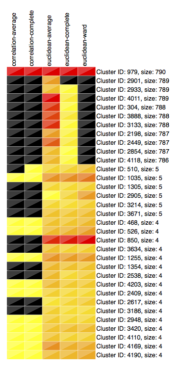
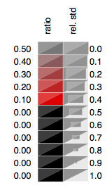
3.2.5. Plot cluster frequencies
Frequencies of clusters can be plotted using the pyGCluster.Cluster.plot_clusterfreqs() function, which also draws a own legend:
>>> cluster.plot_clusterfreqs( min_cluster_size = 4, top_X_clusters = 33 )
The cluster frequency plot is given below.
3.2.6. Save results
It is possible to store the modified pkl file again and save the results for further processing steps:
>>> cluster.save( filename = 'example_1promille_communities.pkl' )
Warning
One should be careful about editing essential stuff in the object like the ‘Data’ entry, because it will be overwritten, once saved.